
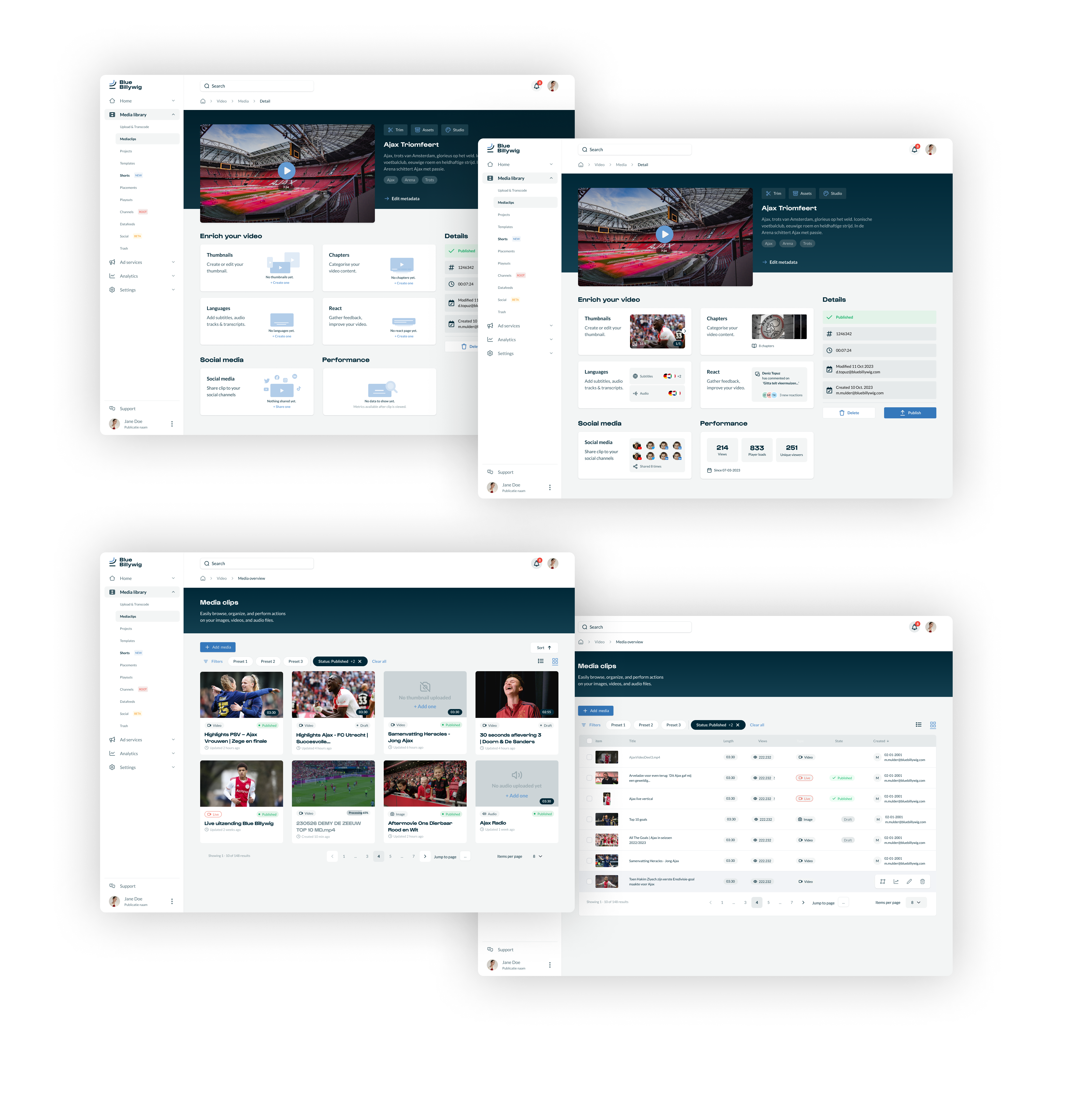
Imagine a cool video platform designed to make your life easier when dealing with video content. It’s like having a helpful assistant for businesses and content creators.
This platform makes uploading, organizing, and tweaking video content a breeze. So, whether you’re a small business or a solo creator, it’s got your back!
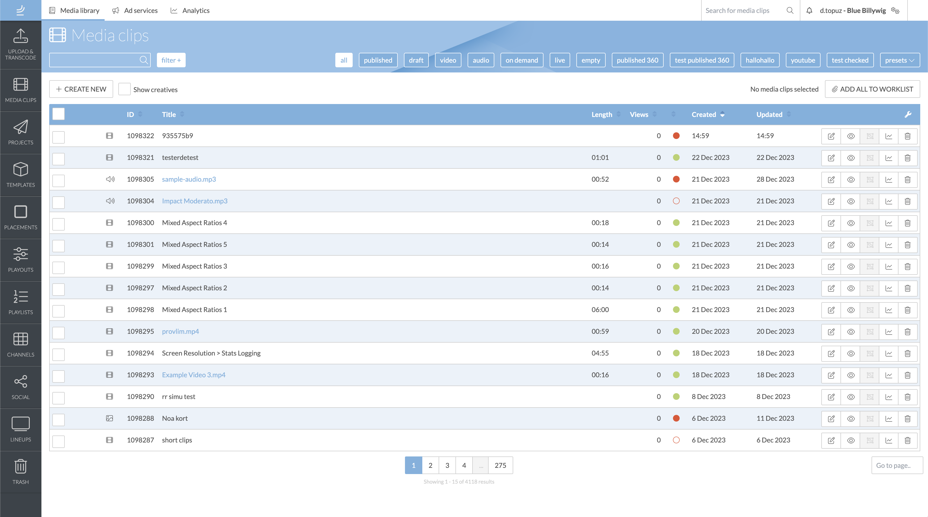
The platform is awesome with all its features, but users find it overwhelming. There are too many options, and you can easily get lost in all the choices.
Our goals
Review and streamline platform functionalities for user relevance.
Simplify navigation and feature usage to reduce reliance on support.
Enhance user experience by minimizing navigation switches.
Update platform design for increased trust and reliability.
Simplify technical language for better user understanding.
Adhere to WCAG AA standards for improved accessibility.
How can we help end-users complete tasks independently on the platform?

We chose for design thinking method due to its emphasis on user-centric innovation, providing a structured approach to problem-solving while encouraging creativity and empathy.
Our process
Understand the users’ needs and perspectives:
Clearly define the problem or challenge to be addressed:
Generate a wide range of potential solutions through brainstorming:
Make specific representations of the proposed solutions.
Gather feedback by testing the prototypes with users.
Refine and improve the solutions based on user feedback, repeating the process as needed.
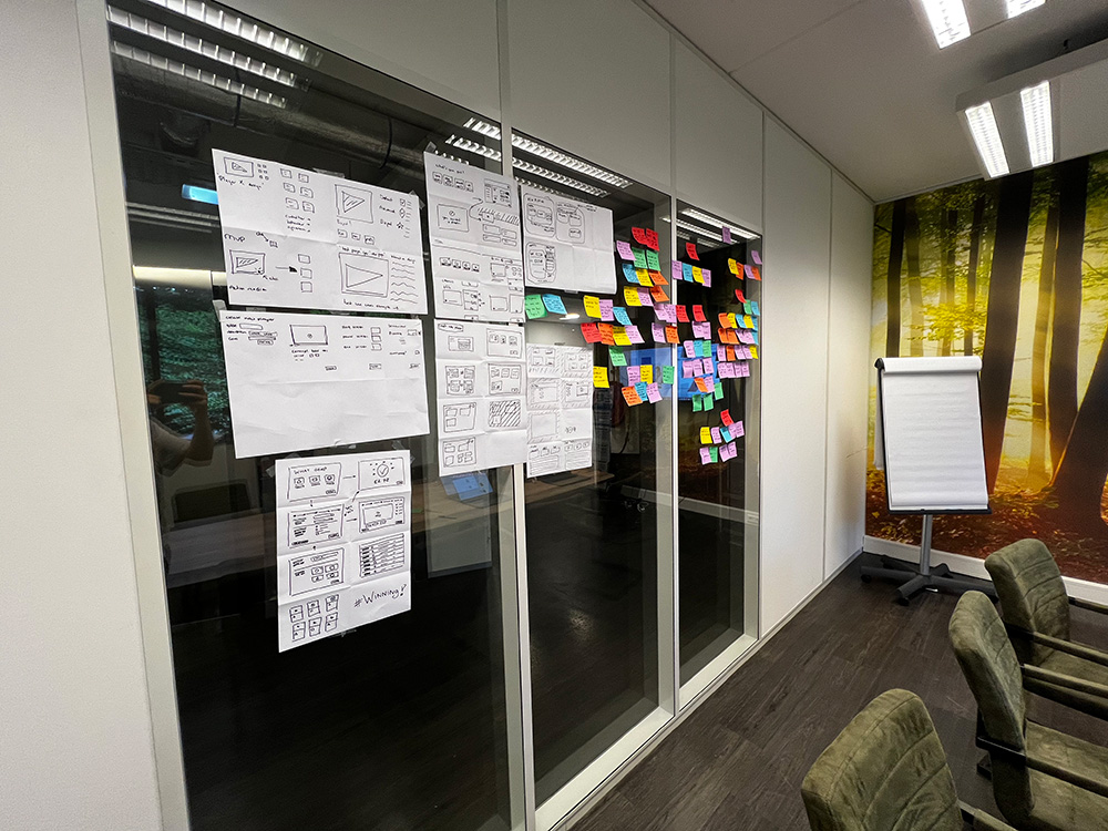
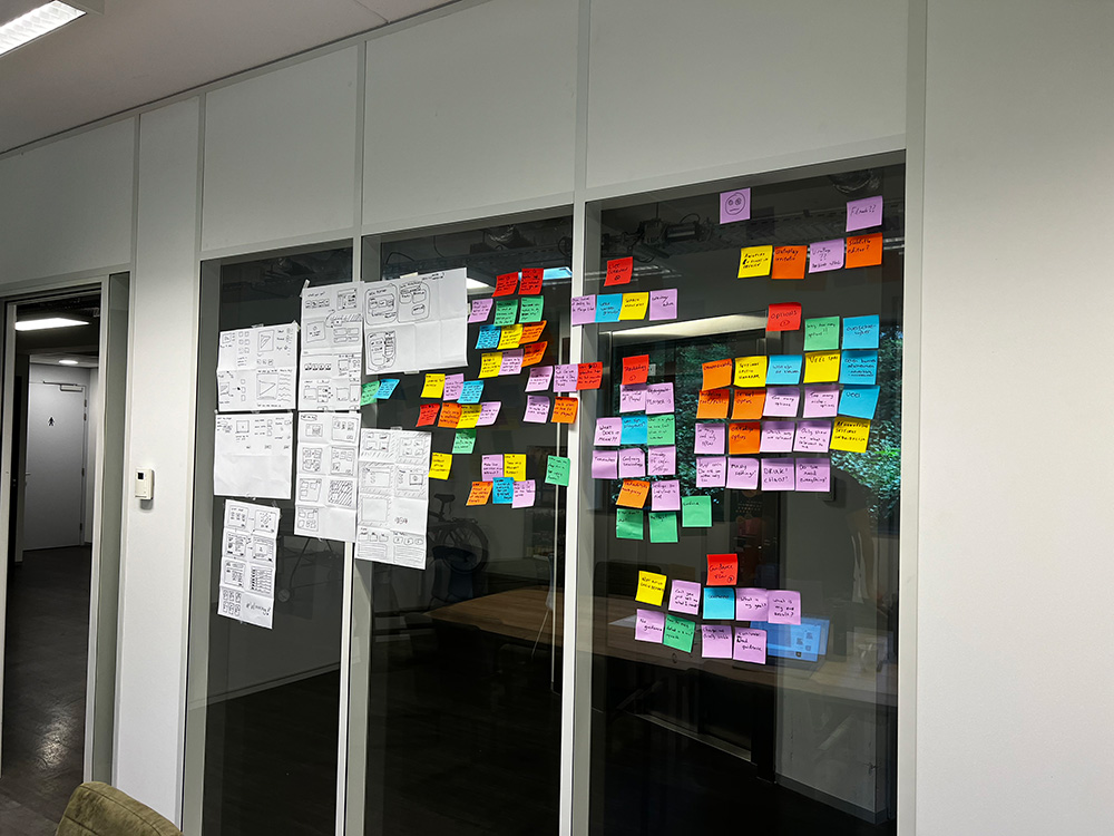
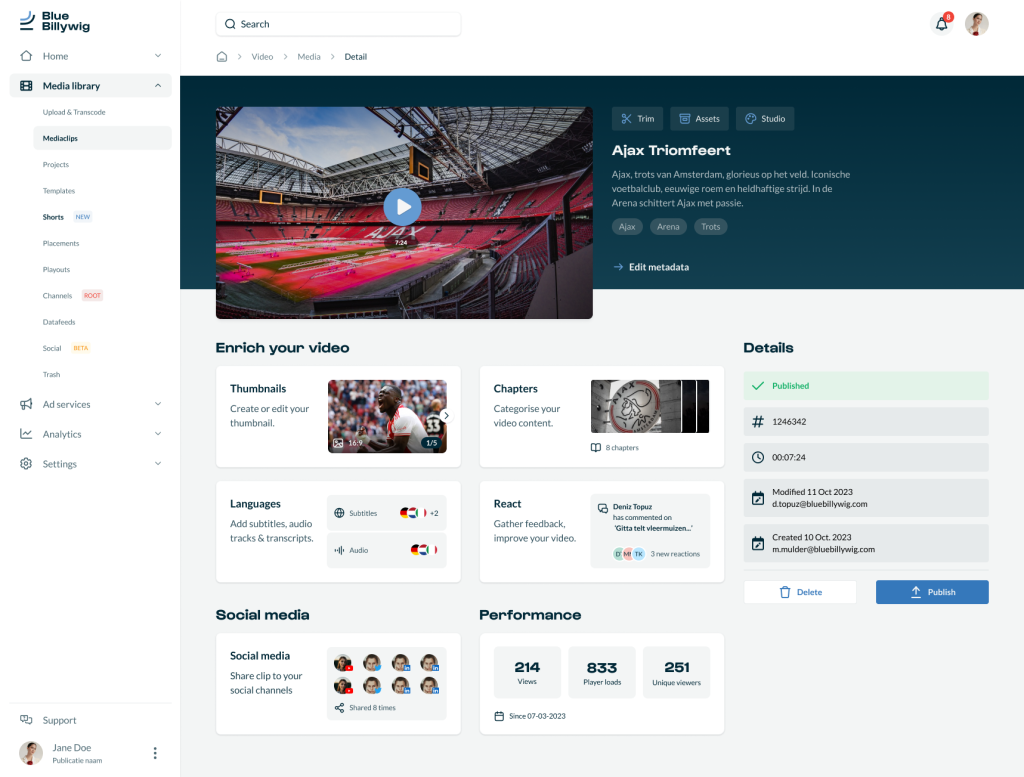
Before diving into Figma, I visualized some concepts using wireframes. This helped me outline ideas and structure before getting into the detailed design work.
Wireframing provided a simplified blueprint, easing the transition to the more refined stages in Figma where I fleshed out the designs with greater detail and interactivity.
Considerations during wireframe development:
Conducted despite challenges with closed systems, gaining insights from FAQs and help centers where possible.
Examined UX/UI patterns of platforms like YouTube, Canva, Vimeo, and Adobe (Express).
Implemented a scalable and responsive grid system to present functionalities in a clear and organized manner.
Integrated concepts generated from brainstorming sessions into the wireframe designs.
After visualizing the wireframes, we achieved:
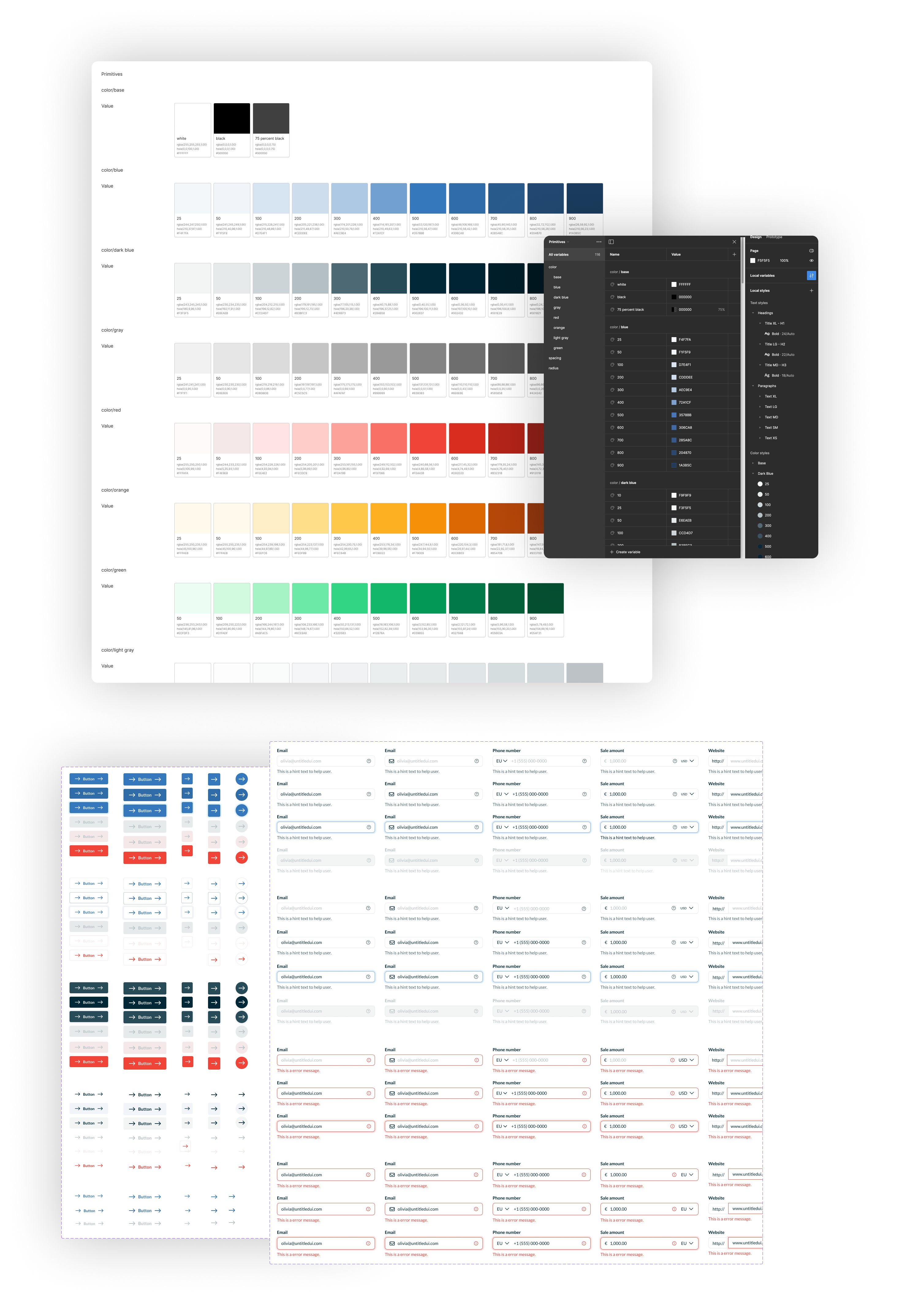
Managing multiple projects simultaneously while developing a design system can be complex and challenging.
Certain UI elements such as buttons, forms, typography, and filter usage behave differently in the redesign compared to the old interface. This can make it challenging to accommodate both scenarios when introducing new functionalities.